Dashboard improvements for small screens
once.to dashboard has got a small facelift which makes it a bit easier to manage on a small screen, like a mobile phone.
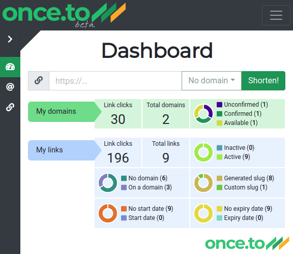
This is how the Dashboard looked like previously on a narrow screen:

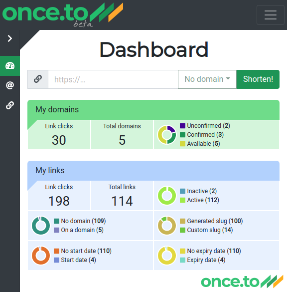
We’ve decided to use the limited screen real estate more efficiently. When the width of the screen is small, the labels shift up so that the metrics can occupy the entire width.
Below you can see the Dashboard view after the facelift:

The appearance of the Dashboard on a bigger screen will stay the same as before.
Tags: blog, clicks, dashboard, mobile, short link, short URL, statistics, usability
