Side that bar: navigation unified
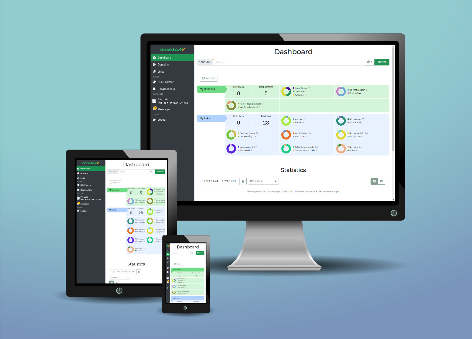
As our world’s best link shortener once.to picks up in popularity, we’re observing an ever-increasing share of users accessing our web application using mobile devices: tablets and, mostly, mobile phones.
That’s why we invest heavily into improving overall experience for this vast user group — and today we announce a number of major enhancements to the application navigation.
Meet the new sidebar and responsive tables!
The sidebar
Previously, the navigation in once.to was a bit patchy: you’d get a sidebar in the Control Center but not, for example, on the Profile page.
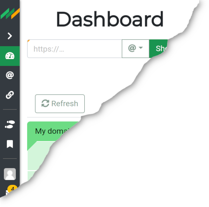
This is now very consistent: the sidebar menu is available in all authorised areas, and is hidden otherwise. What’s even better, this sidebar menu properly adjusts itself, collapsing on a narrow screen, so that it doesn’t occupy the valuable screen estate while remaining fully usable.
Responsive tables
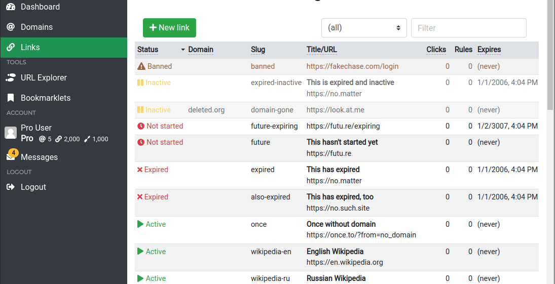
Tables are traditionally painful to properly deal with on a mobile: you usually have a number of trade-offs to consider, involving scrolling and/or zooming in. The result is often ugly, too.
We managed, however, to find a good balance between simplicity, ease of use, and good looks! All rows in once.to’s tables become rectangular bricks on a narrow screen. The table header is then converted into a number of buttons that define table sorting.
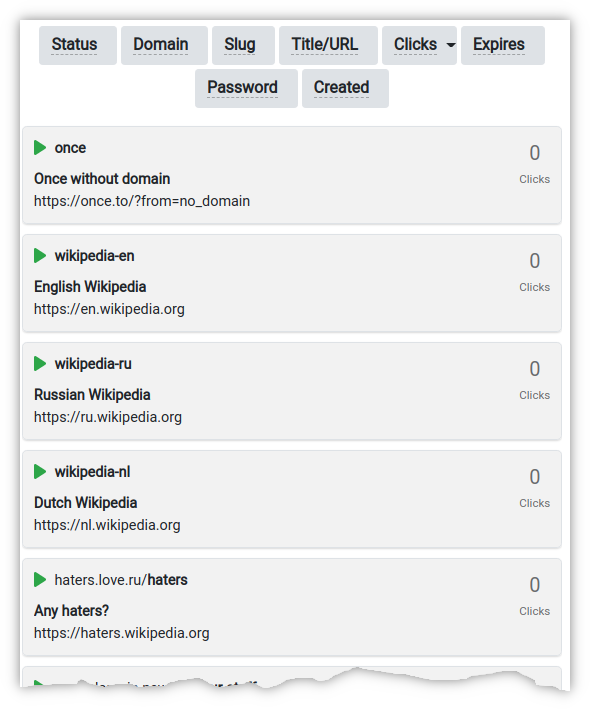
Have a look, it’s purely intuitive:
We hope these changes will make your experience with our service more appealing, and your day brighter!
Tags: blog, dashboard, mobile, short link, short URL, usability, UX